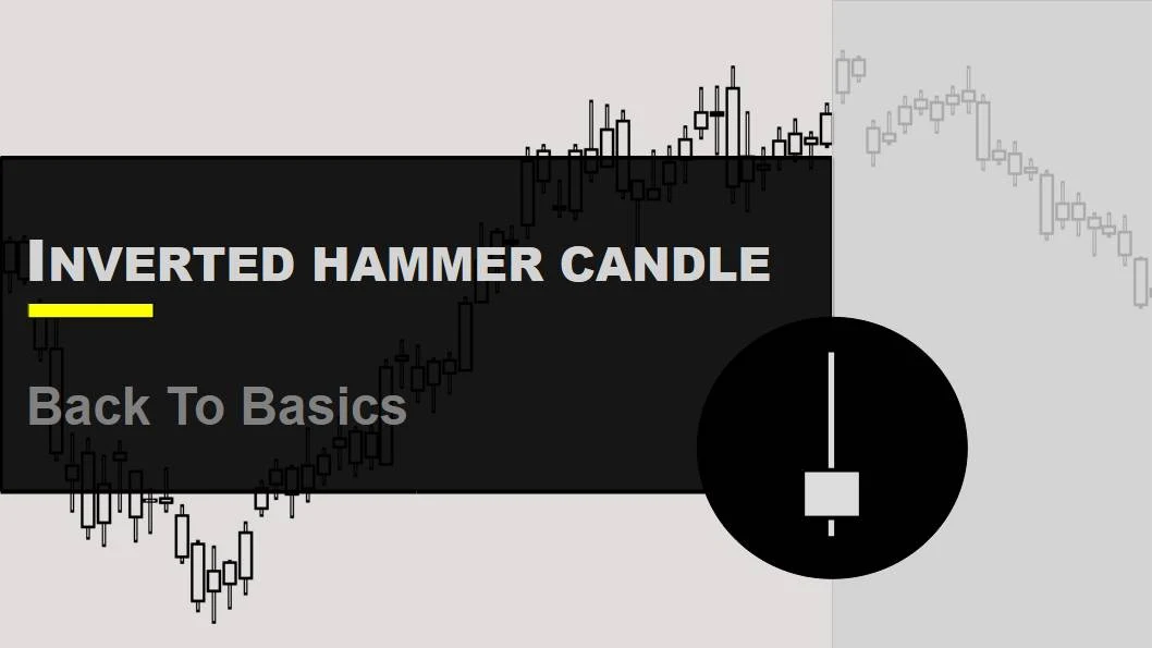
How do you read candlesticks?

Have you ever come across news or other sources discussing how the price of a stock goes up and down? Well, there's a reason behind these fluctuations. Throughout the day, the price of a stock changes multiple times. But, how can you figure out whether the price of a specific stock went up or down during a particular time? This is where price charts step in and become quite useful.
Have you ever seen price charts that show how stock prices go up and down? They're like pictures that help us understand what's happening with stocks. There are different types of charts to represent stock prices, like bar charts, line charts, and something called candlestick charts. In this article, we're going to talk about candlestick charts – what they are, how to figure them out, and what they can tell us.
You see, candlestick charts are like special pictures that help us know if stock prices are going up or down. These charts are super useful when we want to understand how the stock market is doing and even guess what might happen next."
Candlesticks analysis are one of the most important factors when it comes to trading successfully, yet you'd be surprised that the majority of traders use, candlestick patterns incorrectly. An investor who wants to gain insight into the stock market's behavior should understand candlesticks.
Speaking of candlestick charts, they're like treasure maps for the stock market. These charts help us see how the value of stocks moves. They're super important for understanding and guessing how the stock market might act in the future. So, let's explore these charts together!
By using candlesticks, traders and investors can potentially significantly improve their returns while lowering their risks by making well-informed decisions about buying, selling, or holding stocks.
Before we begin, it is important to mention that everything discussed in this section can be used for currency trading, stock trading, and cryptocurrency trading because price action is relatively consistent across different assets.
The first thing that we want to cover with you is What Candlestick Actually Is?
Candlesticks are used by technical analysts to determine when to enter and exit trades because they reflect the impact of investor sentiment on price chart.
Every trader/investor in the financial market tries to forecast the best possible price for entry and exit trades. To do so, they look for chart patterns, and these patterns are formed by grouping two or more candlesticks in a specific way.
Candlestick Chart Anatomy

In order to create a candlestick chart, you must have a data set that contains open, high, low and close values for each time period you want to display.
| Open | Price at the beginning of the period |
| Close | Price at the end of the period |
| High | The maximum price achieved during that period |
| Low | The lowest price of the asset during the period |
The high and low prices in stock trading refer to the highest and lowest prices of the stock in a given time period.
The open and close prices of a stock are the prices at which it began and ended trading in the same period.
A candlestick chart is one of the basic and well-known styles of financial charts used to show price movement. Depending upon the price movement there can be no upper shadow, no shadow, or a very small body. Traders use candlestick charts to forecast price movement based on previous patterns.
How to read candlesticks?
A bullish candle forms, When the close is higher than the open, and
A bearish candle forms, When the close is lower than the open.
A green (or white) body indicates that the price of an asset increased during the day's trading.
A red (or black) body indicates that prices ended lower than they were at the day’s opening.
There are various types of candles available in the financial market like Doji, Marubozu, Bearish Continuation, Three Side Down, and many more. Every trader tries to identify these candles and put their trading technique into action, in order to make a profit.
Have a look at the daily price chart of the GBP-USD pair
OPEN: 1.30007
CLOSE: 1.28046
LOW: 1.27783
HIGH:1.30388
The price chart above is a daily chart of the GBP-USD pairs. Each candle represents the trading activity during the day. In simple words, each candle represents how many shares/ securities have been bought and sold during the whole day.
Now, you can clearly see the closing price is lesser than the opening price (1.28046 < 1.30007). Hence a bearish- red candle has been formed.

OPEN: 1.32323
CLOSE: 1.32393
LOW: 1.32290
HIGH:1.32480
The price chart above is a 15 min. chart of GBP-USD pair. Each candle represents the trading activity during the 15 min. session. In simple words, each candle represents how many shares/ securities have been bought and sold during the 15 min. time interval.
Now, you can clearly see the opening price is lesser than the closing price (1.32323 < 1.32393). Hence a bullish- green candle has been formed.
Components of Candlesticks
Now, we are going to discuss each component of candlesticks, i.e color, range, and body size.
COLOR—- The color is generally displayed as green and red candles (white or black candles). In this course, we are using green and red candles.
- Green/white candles are bullish, closing higher than open.
- Red/black candles are bearish, closing lower than open.
- The range of a candle is the distance between the high to the low.
- The range of a stock represents the volatility of the price during the trading session.
- A wide range shows the increase in volatility.
- A narrow range shows less volatility during the session.
- The body size shows the degree to which the bulls or the bears were dominating the market.
- A large body shows an increase in momentum.
- A small body shows a reduction in momentum.
It's important to understand these terms because we'll be using them throughout the course.
History
Origin: The idea comes from rice trading established in Japan in 1654. Japanese did a very good job of keeping candlesticks from the Western world, but in the 1980s, Westerners took over these nebulous charts.
Since then, candlesticks have been gaining in popularity throughout the year, and these days they seem to be the standard form most traders work from.
Until the late 1980s, bar charts were used by the Western world. A bar chart displays prices shown in the figure below:

Let's look at a real example: The figure below shows a bar chart, while the next figure is the same chart but uses candles instead of bars.
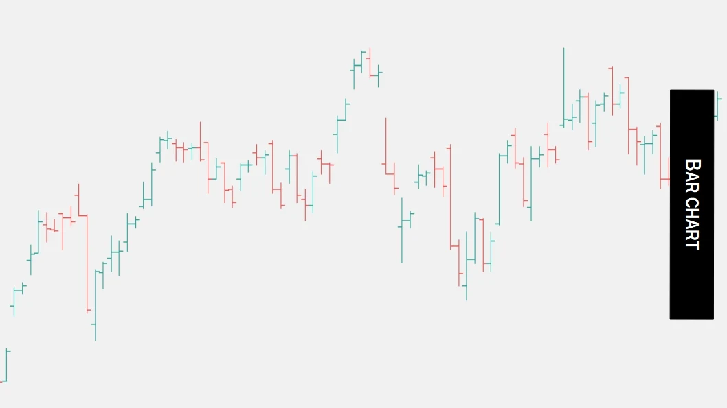
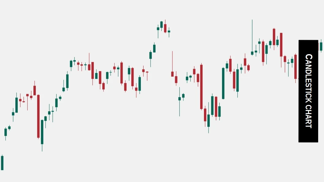
- Candlesticks are easier to read.
- Bar charts are factual but uninspiring.
- Candlesticks chart are also factual and emotive as well.
- Looking at the Japanese candlestick, it is easy to determine whether the period is bullish or bearish (by color).
Decoding Candlestick Formation
Trading is often driven by emotion, which can be seen in candlestick charts. Stock market price movement is a reflection of mass crowd psychology, which consists mostly of greed and fear. So to understand the greed and fear among the participants, traders use a price chart.
- Candlesticks show the fight between bulls and bears during the selected time.
- A long green candle indicates there is a strong buying pressure meaning the trading session was controlled by the buyer which indicates the market is bullish.
- A long red candle indicates there is a strong buying pressure meaning the trading session was controlled by the seller which indicates the market is bearish.
Rules to follow with candlesticks
- Don't trade solely based on any candlestick which means Along with candle always look for other price action signals before entering in trade.
- A stop loss is an absolute must for every trade you take based on candles.
- Use a candlestick in combination with an area of support and resistance.
- Use candles to boost your trading setup.
- Candles can generate false signals, don't expose your money unnecessarily to others.
- Look for the longer candle. Long the candle wick, the better it will be.
- One of the limitations of the candlestick is that waiting for confirmation can result in a poor entry point. Hence use other price action strategies or indicators for the best possible entry.
- Candlesticks are a reflection of what buyers and sellers are doing in the market so if your strategy fails then immediately get out of the trade.
- Last but not least, More candles tell a better story.
How do we use candlestick patterns?
Many traders try to forecast the best possible price for entry and exit trades. To do so, they look for chart patterns, and these patterns are formed by grouping two or more candlesticks in a specific way, which results in low-quality trades.
what we like to do is combine candlestick patterns with key levels, in areas of confluence to increase the quality of the trade, and the higher the trade quality, the higher the percentage chance of success.